US Tile
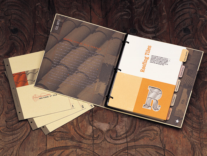
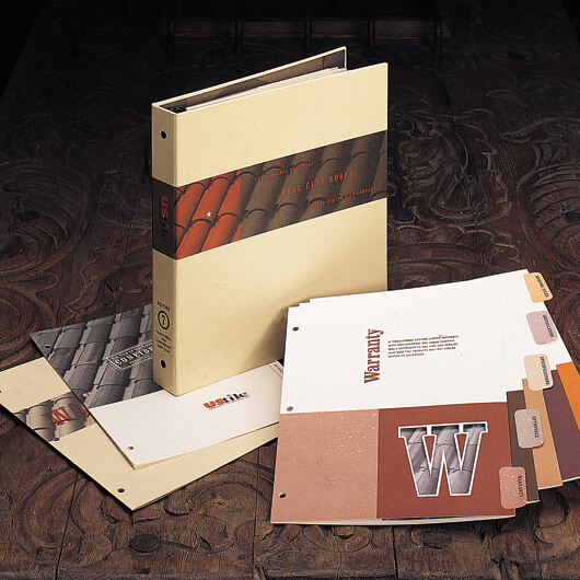
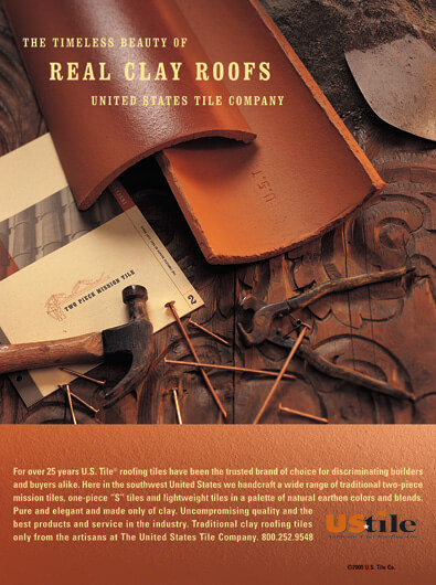
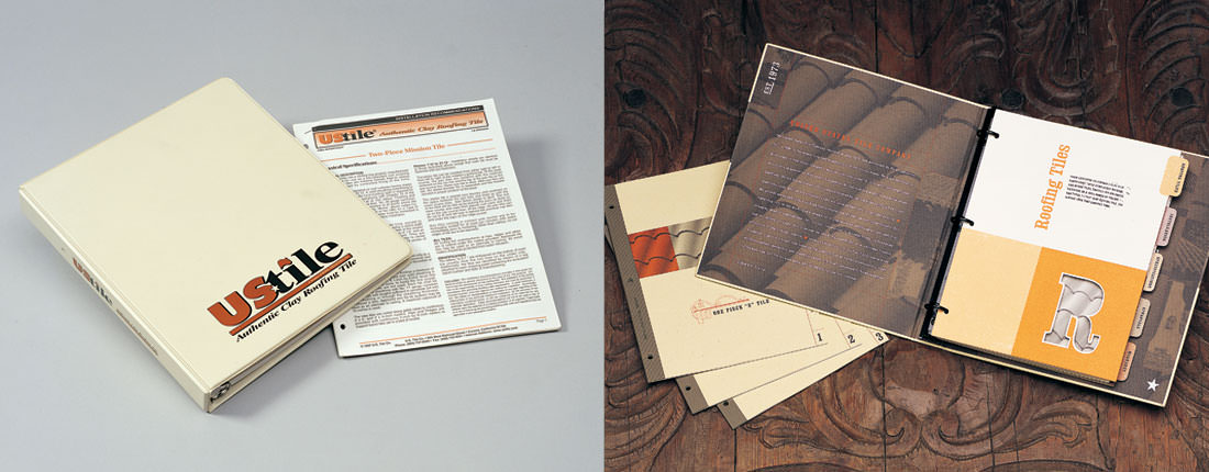
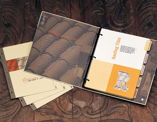
StudioConover was hired to redesign US Tile’s specification binder, installation instructions and corporate ad campaign. The specification binder reveals the graceful patterning of the single-piece clay barrel rooftile and tabbed dividers organizes information into easily accessible categories. Installation instructions, previously commingled, are now separated into three separate and logical categories. The ad campaign depicts the all-natural, clay building product that it truly is.
THE CHALLENGE
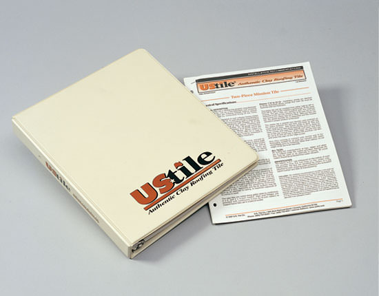
Vinyl again but at least it’s not white. Yet this previous binder design suggests something more “left brain” and “engineer” than the all-natural, clay building product it aspires to be. (Don’t be mistaken, left-brain logic is very important for a rooftile brand; just not upon a first encounter.)
THE SOLUTION
The newly-designed specification binder‘s inside cover reveals the graceful patterning of the single piece clay barrel rooftile printed in subtle dark, clay tones on a chocolate colored natural paperstock. The black matte powdered coated ring binder hardware holds tabbed dividers organized into easily accessed categories. Specially-bound installation instructions that had previously been commingled, are now separated into three separate and logical categories. These revised specification binders — now — exemplify the all-natural, clay building product that it truly is.
Downloads Press Recognition, Before and After