
Thompson Building Materials
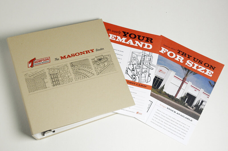
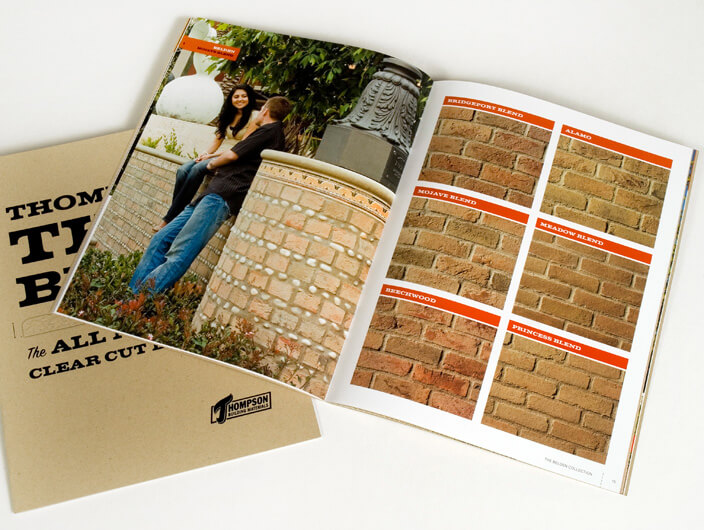
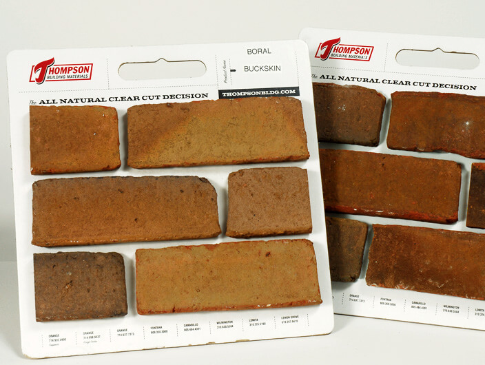
A chance encounter with past Thompson Building Materials advertisements revealed a distinct and evocative period style that inspired StudioConover’s newly redesigned specification binder, website product brochure and sample packaging. Visually reminiscent of classic instruction manuals Thompson’s newly-voiced brand is designed and written with a retro and whimsical style. The overall demeanor is reverent yet cheeky.
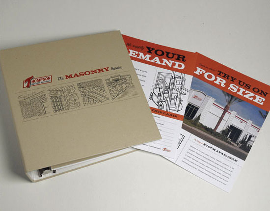
The Challenge
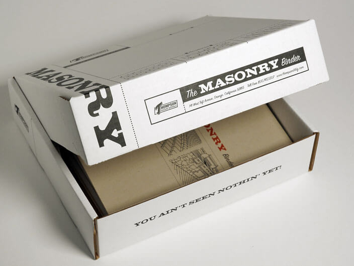
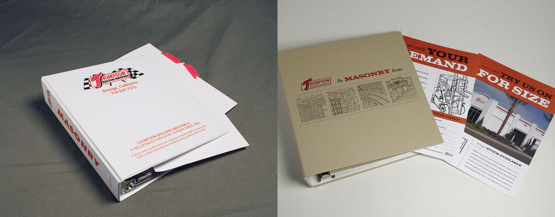
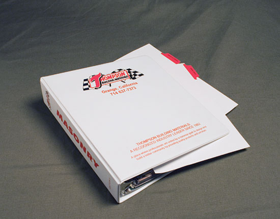
The ever-present white vinyl binder (once again) refuses to wither. But in doing so, does it not say “standard office supply fare” more than anything else? Thompsons Building Supply deserves a spec binder that is more representative of their products than what white and red and vinyl can offer.
The Solution
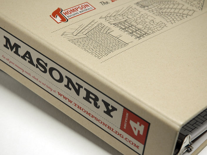
A chance encounter with past Thompson Building Materials advertisements revealed a distinct and evocative period style that inspired StudioConover’s newly redesigned specification binder. The outside cover of the binder is wrapped in uncoated buff-colored paperstock and printed with a double-hit of white ink to make sure the corporate mark was easily seen. Inside, tabbed dividers and pages are visually reminiscent of classic instruction manuals and are written with a retro and whimsical style. The overall demeanor is reverent yet cheeky.
Related Links Website
Downloads Before and After, Taglines and Naming