Redland Clay Tile
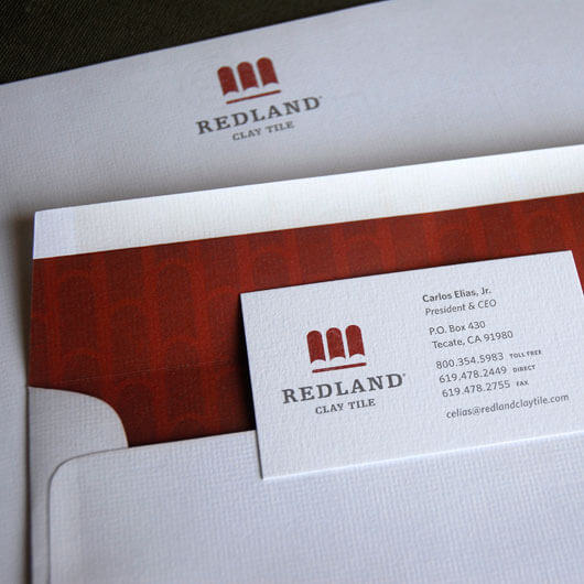
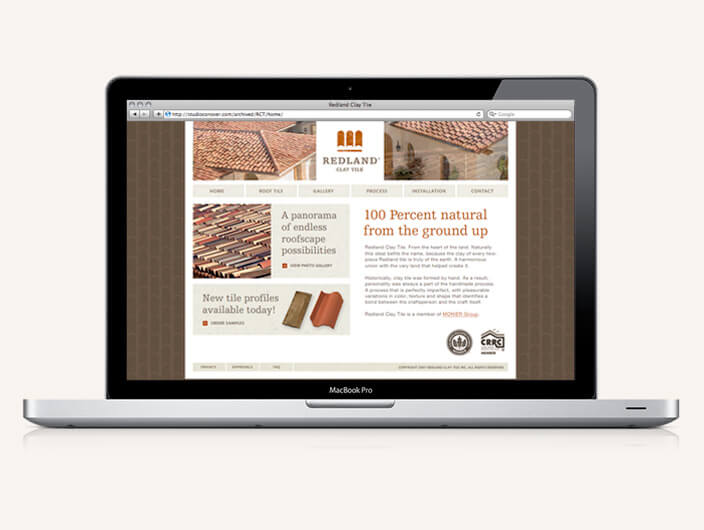
The comprehensive re-brand for Redland Clay Tile, a clay tile manufacturer located in Mexico, fulfills the promise of an all-natural clay product. Considering Redland’s product is a handmade, clay tile, it was important to imbue the inherent characteristics and represent its rough-hewn attributes relevantly. A color palette representative of the materials was specified for printed and online components. Color, texture, clarity and a unified voice remain consistent throughout each component touchpoint.
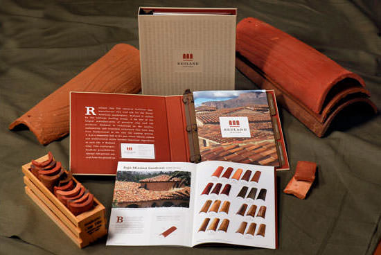
THE CHALLENGE
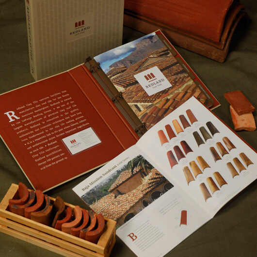
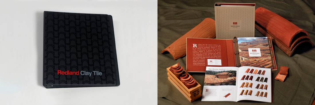
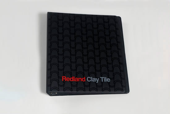
Having previously specified Redland Clay Tile for residential projects we’ve worked on, we had a copy of their previous specification binder in our materials library. Its impression as an off-the-shelf black vinyl binder did not project the beauty of their product line.
THE SOLUTION
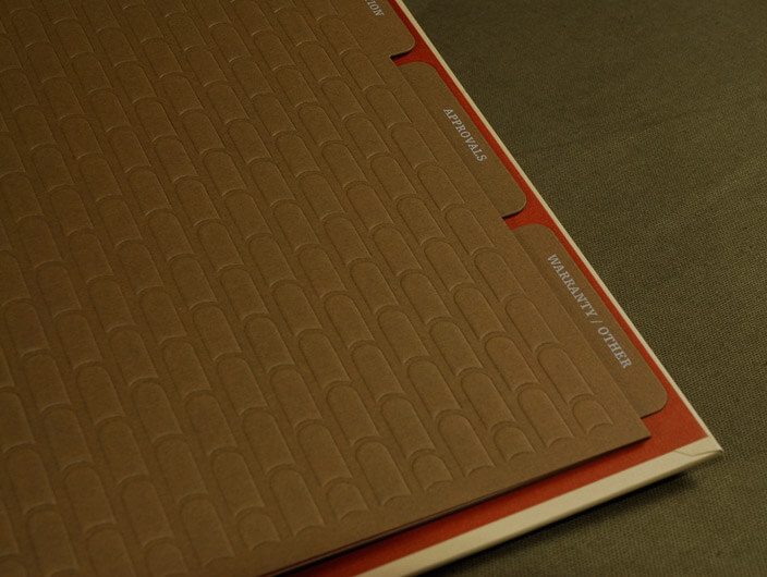
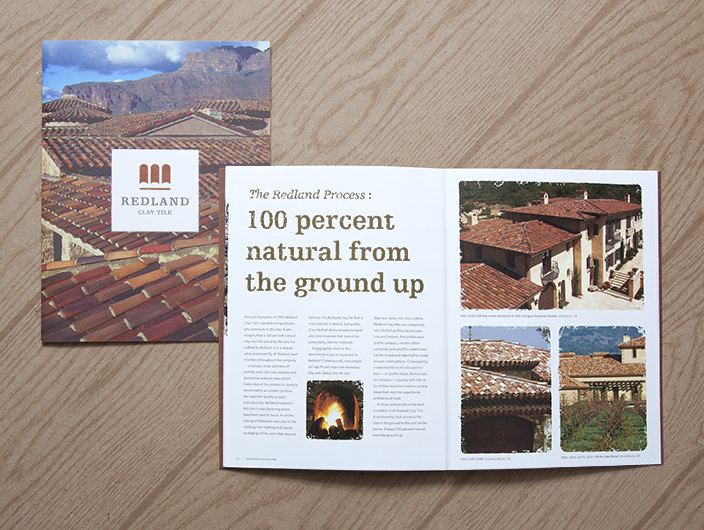
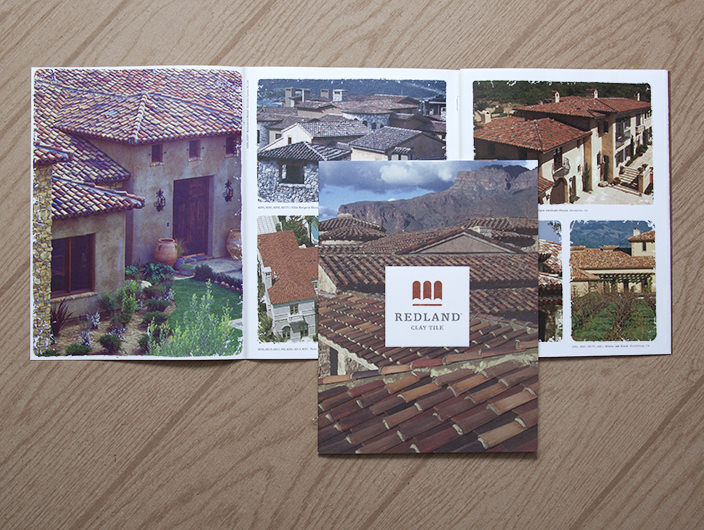
We printed a rough-hewn rooftile pattern on textured, uncoated paperstock and wrapped the outside of the binder. The inside binder liner — printed on rust-colored paper — displayed distressed typography and declared the Redland story adjacent to a tipped-in business card holder for Sales Representatives. Their newly designed corporate mark adorned both the cover of the binder and the re-designed product brochure. A color palette representative of the earthen clay materials used for their product was specified for both printed and online components.
Downloads Before and After, Taglines and Naming